During my internship, I was challenged with creating numerous potential logos for a business, including a brand name, domain name, social media handle, etc. With this logo, I included a basketball icon to communicate the main service provided by that company (basketball on trampolines), used warmer colors and a sharper font to evoke a more excited feel, as well as connect to how warmed up most sports players feel after working hard, evoking an energetic yet mature tone.
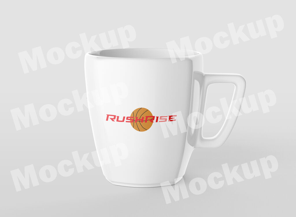
Like with the logo above, this design was a part of a challenge during my internship to create potential logos for a business. With this logo, I used a similar color scheme and iconography to communicate the service of basketball provided by the company. I did instead use multiple colors for the different balls on this logo, and also used text size so that it looked as though it was rising with the basketball.
During my Elements and Principles of Design class, I was tasked with creating an official logo for another program called CAST. The logo above is one of three created by me, as well as my personal favorite.
The design above was created by me as part of an assignment that was one of many where I had to visually redesign the home screen of an existing website.
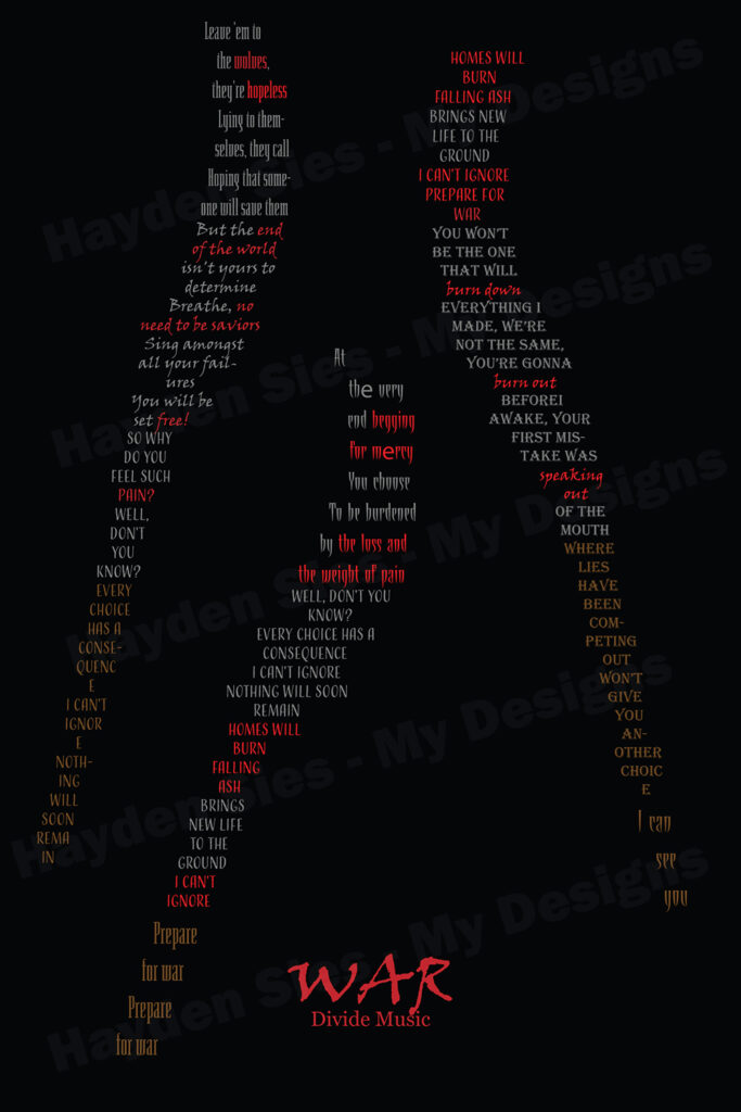
In a Typography assignment, we used type creatively in a layout. I specifically used the lyrics to one of my favorite songs to represent objects that match its tone and content.
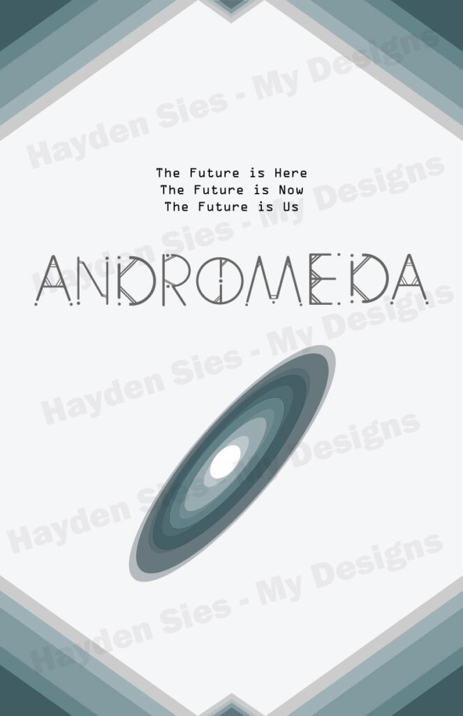
For my Typography class I also created both a custom typeface as well as a logo and tagline for this poster.
This image was created as part of my final project in Elements and Principles of Design, where I conceptualized and designed the logo, color scheme, and interface to an app.
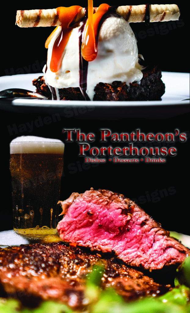
This was a notable project of mine using Photoshop, as I created this menu cover in my Raster Graphics class.
One of my personal favorite projects is this movie poster, which I created based on my idea for a fantasy story and using the software Adobe Photoshop.
In my Introduction to Digital Marketing class, we were tasked with creating branding guidelines for a fictional brand that each of us created. I designed the logo above for my idea of a comic book publisher, Red Raven Comics.
For my Photography class, one of the assignments I was given was the use of lighting to create a portrait photo, and this was among the best I took.
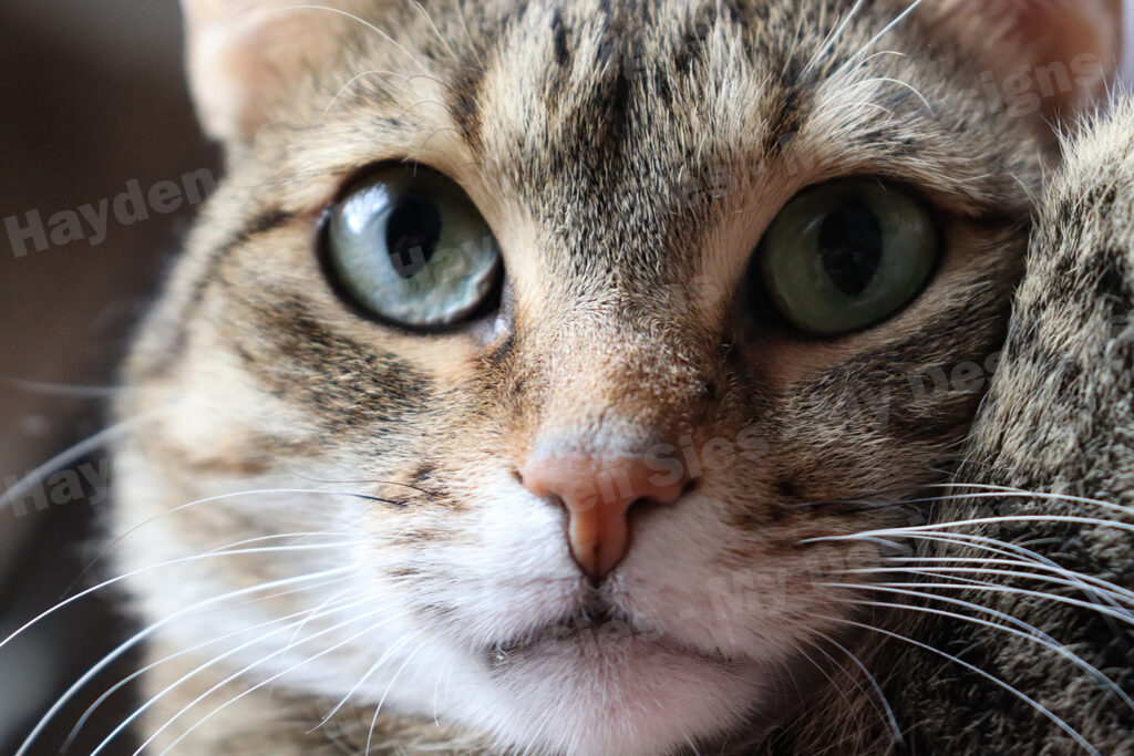
During my Photography class, I learned of numerous different types of photography, as well as aspects of photo, including the subject of the photo itself. This image is an example of Strong Subject photography.
One of my favorite classes in IDT was the Art History class, where I also learned about numerous different styles of art and design, including Cubism, which inspired this design of mine.
Another important aspect of photography which my class discussed was the use of repetition, and how it creates a strong sense of unity within a photo, which led me to take this photo.
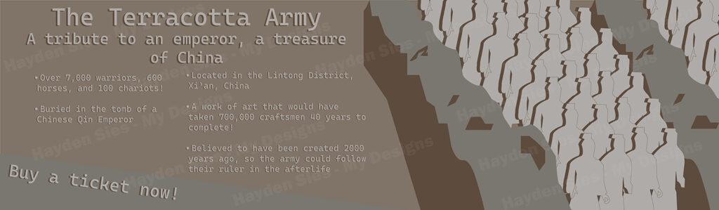
In Art History, we also studied and discussed several historical examples of art and the miraculousness of their existence, such as the Terracotta Army in China, which I created a personal advertisement for.
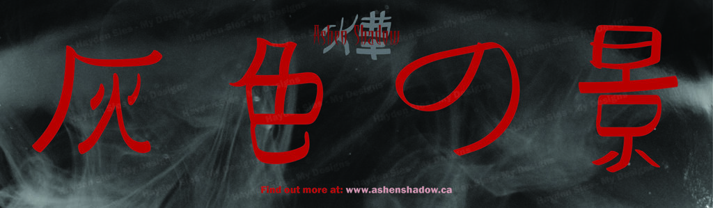
For my final project in Interactive Design & Technology, I chose to create a brand package for a fictional video game franchise based on an idea I had for a story in a fantasy setting, with the name “Ashen Shadow”. My vision for the story, characters, and world was for it to be gritty and dark, but also visually striking, where brutality and beauty go hand-in-hand, even juxtaposing each other. This design is a social media banner which I created as a part of the brand package for this franchise.
This design here was created for use as a billboard for my fictional franchise “Ashen Shadow”.
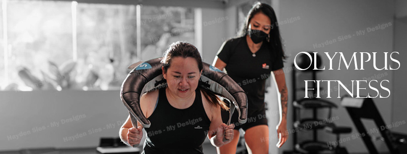
I created this design using both Photoshop and Illustrator as a web graphic meant to advertise my fictional fitness gym business called “Olympus Fitness”.
Using Photoshop and Illustrator I created this web graphic to advertise a fictional business I created named “Olympus Fitness”.
The final web graphic I made for my fictional fitness business assignment, this design is a mock-up for that company’s website.
One of the photos I took which focused on the use of shutter speed, specifically to create a unique image with the motion blur effect.
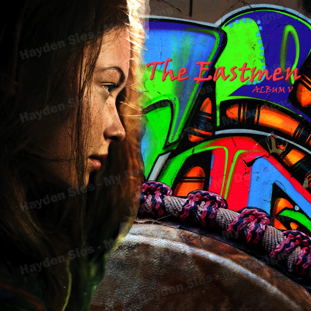
For my Advanced Raster Graphics class my final project, which is displayed here, makes use of photos to design album covers for fictional bands.
For my Contemporary Graphic Design class, I took inspiration from the Bauhaus style of design to create this ad for PlayStation, as it is my favorite gaming console.
Another assignment and design that is inspired both by the gaming industry and a unique, contemporary design style, this project of mine was based on the International Swiss style.
This was the final design of mine for my second assignment in Contemporary Design, and takes inspiration from the Plakatstil style.
This is yet another project of mine from the Contemporary Design class, but unlike the others, is not based on a broadly applied style of design, but rather a specific designer named Saul Bass, and is meant to promote the fantasy novel “The Thousand Names”.
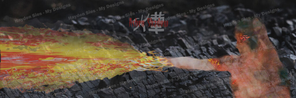
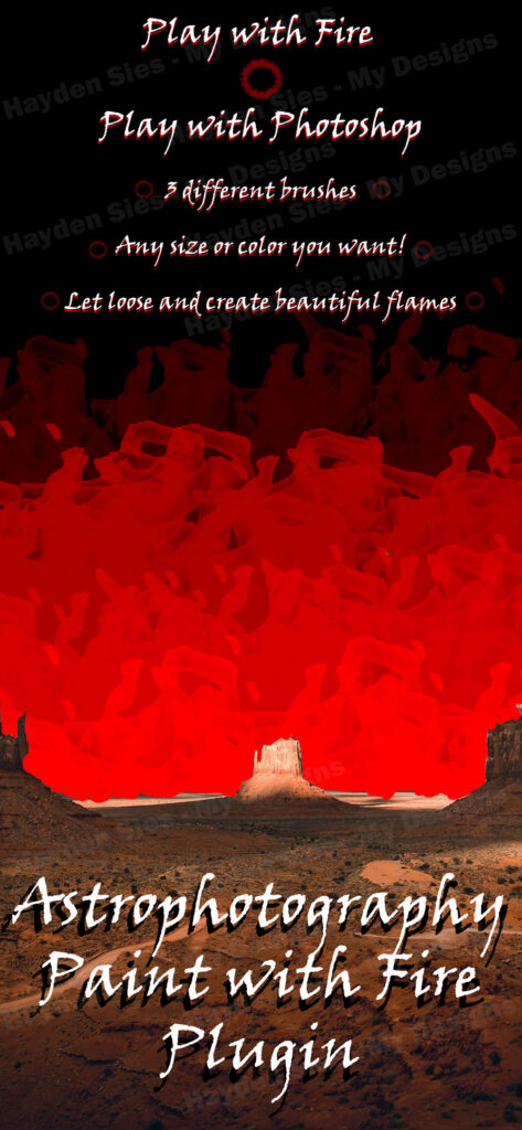
Other than the conventional tools presented to users, my classes also taught me how to use and search for user-created plugins like that one I used for the design above, “Paint with Fire”.
Whereas the “Paint in Fire” plugin was used in Photoshop, the “Vector Glitch” plugin I used for this design was installed in Illustrator.
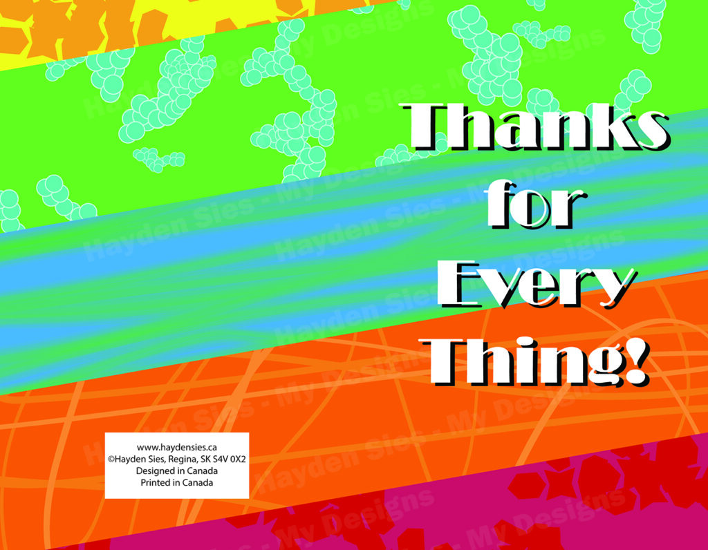
For both Illustrator and Photoshop, the Brush tool and the ability to create custom brushes is as fun as it is beneficial when creating designs, such as the one I created above for a birthday card design.
Another entry for my fictional brand package, I designed this poster to communicate both the main protagonist as well as the environment and setting of the story.
The last poster I created for my “Ashen Shadow” brand package, where the setting is less of a focus but still present, and also demonstrates the main character’s supernatural ability to wield smoke and fire.
I designed this logo for use in every web graphic that I created to advertise “Olympus Fitness”. With this logo, I choose typography that feel powerful but also regal to match the imagery of mountains, which itself ties back to the use of “Olympus” in the business name, referencing “Mt. Olympus”, the famous home of the Gods in Greek mythology, further invoking a feeling of power and excitement from the viewer.The logo for my “Ashen Shadow” brand package, which makes use of both English as well as the title when written in Kanji. To make the title stand further out from the background calligraphy, I used brighter, more pronounced colors, but not too contrasting that it felt out of place.